
List view
Getting Started
Getting Started
Customizing Notion Blocks
Customizing Notion Blocks
References
References
Customizing your site
Customizing Navbar
If you're looking to add a personal touch to your Bullet.so site, customizing your navbar is a great place to start. Here are a few CSS code snippets that can help you achieve the look you want:
1. How to customize your own Navbar
Craft a navbar which automatically adjusts its width and height based on your requirements.
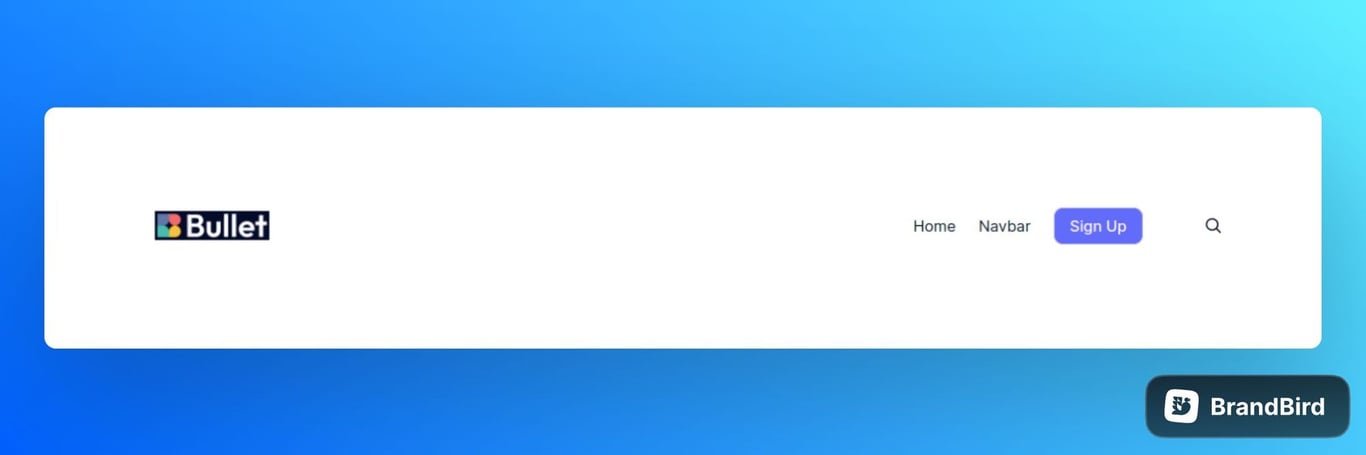
Just copy &paste the below code under CSS code in Navbar.
.bullet-navbar{
    padding-left: calc((100vw - 1225px)/2 + var(--navbar-padding));
    padding-right: calc((100vw - 1225px)/2 + var(--navbar-padding));
}
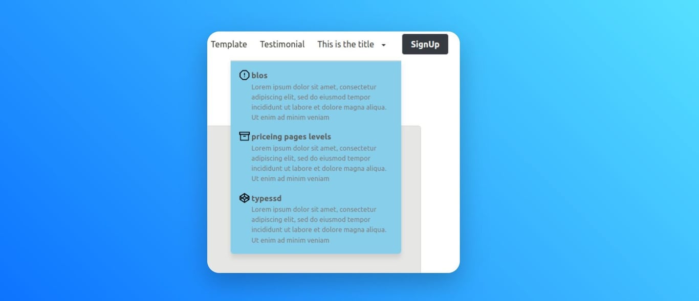
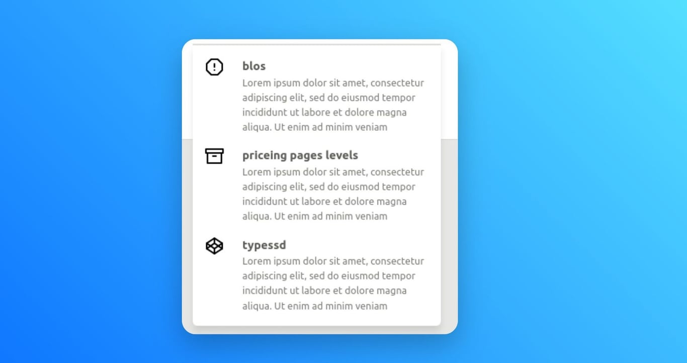
2. How to place icon before CTA in Navbar
Use the code below given to design your navbar by placing a icons before the call-to-action (CTA) button.
.bullet-navbar-cta {
  order:10;
}
Just copy & paste the code to achieve the result like given below.

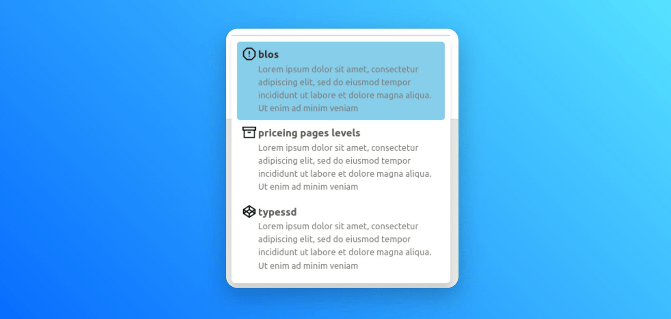
3. How to change background color of the dropdown menu
Customize the background of your dropdown menu to reflect your unique style and design preferences using the below given code.
.navbar-dropdown {
  background: skyblue;
}
.nav-drop-item-container{
  background: skyblue;

}
Just copy & paste the code to achieve the result like given below.
4. How to change hover background for your dropdown menu
Customize the hover background of your dropdown menu item to reflect your unique style and design preferences.
.nav-drop-item-container:hover {
  background: skyblue;
}
Just copy & paste the code to achieve the result like given below.
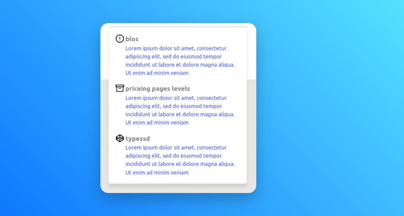
5. How to change content color in dropdown menu
Customize the color of dropdown titles and descriptions to align with your design preferences, resulting in a visually unified and captivating navigation experience.
.nav-drop-title {
	color: gray;
}
.nav-drop-desc {
	color: blue;
}
Just copy & paste the code to achieve the result like given below.
6. How to adjust the size of the dropdown item in Navbar
Customize the width of dropdown item to achieve the desired visual balance and alignment, enhancing the overall aesthetics and readability of your navigation menu.
.nav-drop-icon {
	width: 45px;
	height: 45px;
}
Just copy & paste the code to achieve the result like given below.
7. How to add Glass Effect for Navbar
In Bullet, there's an attractive feature that allows you to create your navigation bar with a glass effect. This glass effect adds an element of sophistication and transparency, effortlessly harmonizing with your website's layout, resulting in a visually appealing and modern appearance.
:root {
  --navbar-bg-color:rgb(19 20 20/6%);
  --navbar-padding:2rem;
}
.bullet-navbar{
    width:60rem;
    margin: 3px auto;
    background-color: var(--navbar-bg-color);
    border-radius: 10px;
    position: var(--navbar-type);
    height: var(--navbar-height);
    top: 20px;
    padding-left: var(--navbar-padding);
    padding-right: var(--navbar-padding);
    z-index: 999999;
    backdrop-filter: blur(10px);
}
.navbar-link{
  background-color: unset !important;
}
.navbar-menu{
  background-color: unset;
}
.navbar-item:hover{
  background: unset !important;
}
Just copy & paste the code to get attractive result of the navbar with glass effect as below:

8. How to a stable header
In this section, you will explore the way to make the header as stable. Use the below given code snippet to make a stable header.
 .notion-table-of-contents {
    position: sticky;
    top: var(--navbar-height);
    overflow: auto;
    height: 100vh;
}
Explore other appealing parts of our bullet.so navbar
Variables
Customize your navbar effortlessly with our versatile variables. Adjust colors, fonts, spacing, and more to match your brand or design. Simple variable code delivers an appealing and attractive website navbar.
Variable | Description | Supported Values |
--navbar-bg-color | Sets the background color of the navbar. | Any valid CSS color value |
--navbar-fg-color | Sets the foreground color (text color) of the navbar. | Any valid CSS color value |
--navbar-btn-bg-color | Sets the background color of the call-to-action buttons. | Any valid CSS color value |
--navbar-btn-fg-color | Sets the foreground color (text color) of call-to-action buttons. | Any valid CSS color value |
--navbar-brand-font-size | Sets the font size of the navbar brand/logo. | Any valid CSS font-size value |
--navbar-brand-logo-width | Sets the width of the navbar brand/logo. | Any valid CSS width value |
--navbar-padding | Sets the left and right padding of the navbar. | Any valid CSS padding value |
--navbar-shadow | Sets the shadow properties for the navbar. | Any valid CSS box-shadow value |
--navbar-align-links | Sets the alignment of the navbar links. | "left", "center", "right” |
--navbar-type | Sets the type (e.g., static, fixed, etc.) of the navbar. | "static", "fixed", "sticky", "absolute", "relative” |
The "Supported Values" column provides an overview of the types of values that can be used for each CSS variable. Feel free to modify these variables using the supported values to achieve your desired customization.
How to use
/* Example: How to use CSS variable */
/* Below code will change the background color and link alignment of the navbar  */
:root {
	--navbar-bg-color: #e4e4e4;
	--navbar-align-links: center;
}
- Copy the provided CSS code snippet containing the navbar theme variables into your CSS file or code > CSS(in bullet site dashboard) section.
- Add or Modify the values of the navbar theme variables according to your desired customization.
- Save the code and publish the site.
Classes
If you require further customization beyond the provided theme variables, you can leverage these additional navbar classes to achieve your desired design.
Class | Description |
.bullet-navbar | Represents the main container for the navbar. |
.navbar-brand | Represents the container for the navbar brand/logo. |
.navbar-brand-logo | Specifies the styling for the logo image within the navbar brand. |
.navbar-item | Defines the styling for individual items within the navbar. |
.navbar-burger | Represents the hamburger icon for the mobile navigation menu. |
.navbar-menu | Defines the container for the navbar menu items. |
.navbar-link | Styles the dropdown links within the navbar menu. |
.navbar-dropdown | Represents a dropdown menu within the navbar. |
.nav-drop-item-container | Defines the container for individual items within the dropdown menu. |
.nav-drop-icon | Specifies the styling for icons within the dropdown menu item. |
.nav-drop-title | Specifies the styling for the title of a dropdown menu item. |
.nav-drop-desc | Defines the styling for the description of a dropdown menu item. |
.nav-cta-btn | Represents a call to action element in the navbar. |
How to use
/* Example: How to use CSS class */
/* Below code will add a shadow and border radius for the navbar call to action. */
:root{
  --border-radius:10px;
}
.nav-cta-btn {
	border-radius: var(--border-radius);
	box-shadow: 0px 0px 4px 0px gray;
}
- Copy the provided CSS code snippet containing the navbar class into your CSS file or code > CSS(in bullet site dashboard) section.
- Add or Modify the navbar classes according to your desired customization.
- Save the code and publish the site.
That’s it!!! Now with the help of the above given snippets, you can enjoy and play with the navbar of the |Bullet website.
On this page
Customizing Navbar1. How to customize your own Navbar 2. How to place icon before CTA in Navbar3. How to change background color of the dropdown menu4. How to change hover background for your dropdown menu5. How to change content color in dropdown menu6. How to adjust the size of the dropdown item in Navbar7. How to add Glass Effect for Navbar 8. How to a stable header Explore other appealing parts of our bullet.so navbarVariablesClasses
 Made with Bullet