
List view
Getting Started
Getting Started
Customizing Notion Blocks
Customizing Notion Blocks
References
References
Customizing Notion Blocks
Customize Toggle
Explore a variety of classes dedicated to toggle, offering granular control over font styles, sizes, weights, line heights, and more.
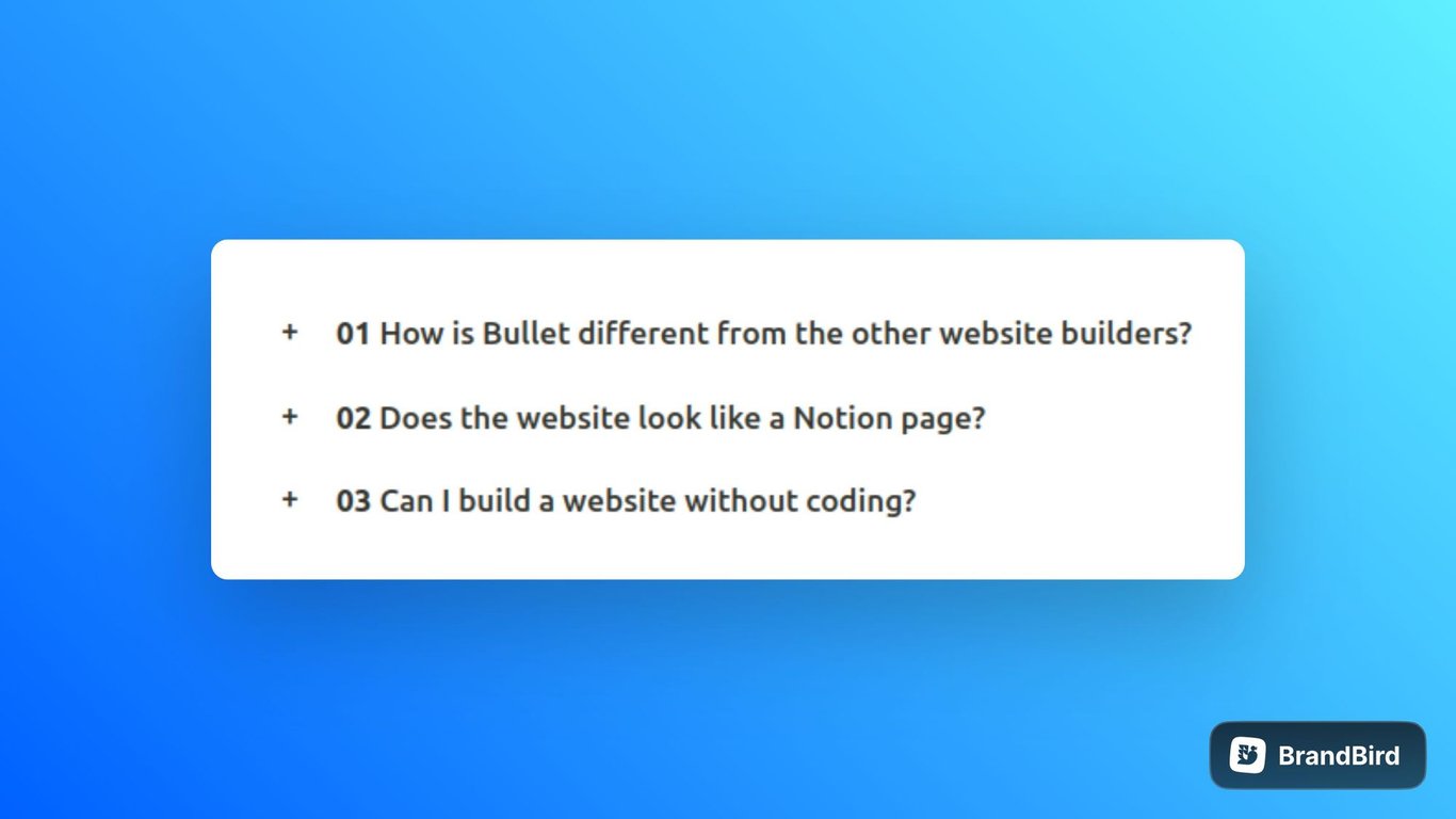
1. How to use custom toggle icon in your site
This section explains you about how to use custom icon as toggle icon of your choice to add a unique touch to your user interface. Use below code snippet to add custom toggle icon. In this code, I have used “+” as a toggle icon in a code.
/* Below code will change the default toggle icon to + icon */
.notion-toggle>div>div {
    font-size: 16px;
}
summary {
    list-style-type: none;
    width: 100%;
}

summary::before {
    content: "+";
    position: absolute;
    left: 0;
    top: 8px;
}

details[open] summary::before {
    content: "-";
    position: absolute;
    left: 0;
    top: 8px;
}

.notion-toggle {
    position: relative;
    font-size: 17px;
    padding: 10px 30px;
    font-weight: 500;
    width: 100%;
}
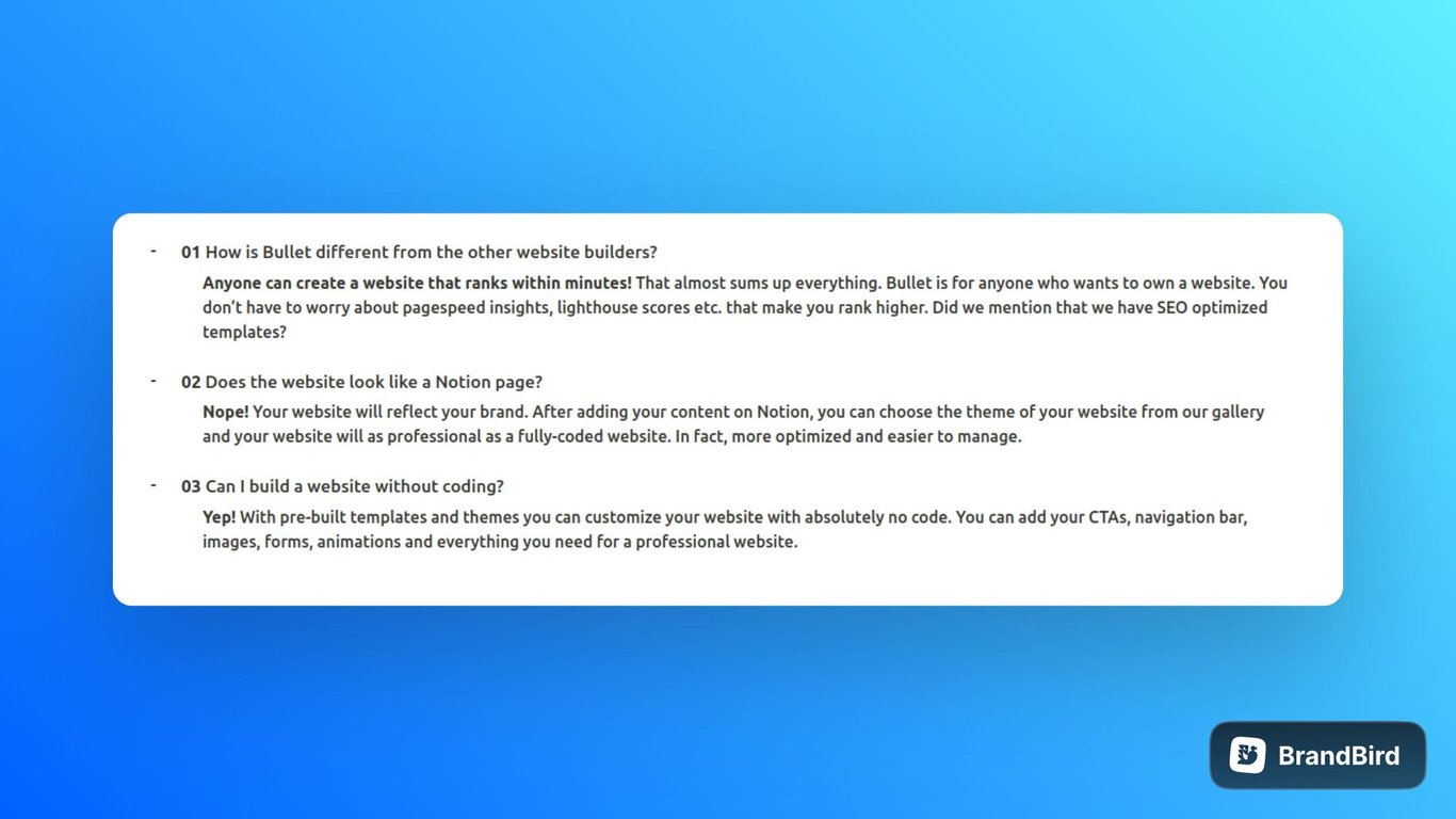
2. How to use default toggle icon to your site
This section explains you about configuring the default toggle icon, allowing users to view the toggle content without having to manually expand it.
Use the below code snippet to showcase the default toggle icon.
// Below code will open all toggle elements by default
const toggle = document.getElementsByClassName("notion-toggle")
const toggleElement = [...toggle]
toggleElement.map((item) => {
	if(item){
		item.setAttribute('open', '')
	}
 });
Explore the additional features using the below classes
Classes
Customize the different toggles on your Bullet site using the provided classes.
Class | Description |
.notion-toggle | Represents the toggle element. |
summary | Represents the summary element within the toggle element. |
.notion-toggle summary > .notion-h1 | Represents a toggle heading 1. |
.notion-toggle summary > .notion-h2 | Represents a toggle heading 2. |
.notion-toggle summary > .notion-h3 | Represents a toggle heading 3. |
.notion-toggle .notion-gray_background | Represents the toggle element with a gray background color. |
.notion-toggle .notion-brown_background | Represents the toggle element with a brown background color. |
.notion-toggle .notion-orange_background | Represents the toggle element with an orange background color. |
.notion-toggle .notion-yellow_background | Represents the toggle element with a yellow background color. |
.notion-toggle .notion-teal_background | Represents the toggle element with a teal background color. |
.notion-toggle .notion-blue_background | Represents the toggle element with a blue background color. |
.notion-toggle .notion-purple_background | Represents the toggle element with a purple background color. |
.notion-toggle .notion-pink_background | Represents the toggle element with a pink background color. |
.notion-toggle .notion-red_background | Represents the toggle element with a red background color. |
How to use
/* Example: How to use toggle CSS class */
/* Gray Toggle Heading 1 - change font size and color */
.notion-toggle .notion-h1{
  font-size: 60px;
  color: blue;
}
- Copy the provided CSS code snippet containing the toggle class into your CSS file or code > CSS(in bullet site dashboard) section.
- Add or Modify the toggle classes according to your desired customization.
- Save the code and publish the site.
 Made with Bullet