
List view
Getting Started
Getting Started

Customizing Notion Blocks
Customizing Notion Blocks
References
References
≡
Customizing Notion Blocks
Customize Gallery View
Discover a wide range of classes tailored for customizing gallery views and unlock the ability to transform and style gallery view cards to suit your design preferences and enhance the overall user experience.
1. How to customize hover effect of Gallery cards
Enhance the hover effect on your gallery cards by customizing their appearance. Add visual flair, transitions, and interactive elements to create an engaging and dynamic gallery view experience.
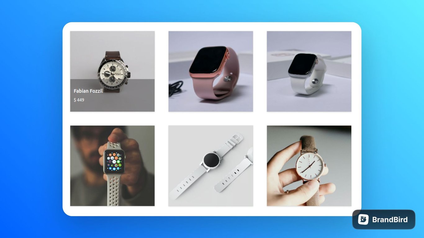
2. How to make overlay Gallery Cards
In this section, you will came to know the process of making a gallery card using overlay features. Use the given code snippet, to make a overlay gallery cards.
:root{

  --border-radius:5px;
  --db-card-gap:40px;
  --db-cover-height-small:230px;
}

.notion-collection-card-body{
  display: none;
}
.notion-collection-card-cover:hover +.notion-collection-card-body{
  display: block;
}
.notion-collection-card-body:hover{
  display: block;

}
.notion-collection-card{
  position: relative;
}
.notion-collection-card-body{
  position: absolute;
  bottom: 0;
  color: white;
  background: rgba(56,56,56, 0.45);
  padding: 20px 10px;
}
.notion-collection-card-body{
  width: 100%;

}
.notion-collection-card-body .notion-page-icon-inline{
  display: none;
}
.notion-collection-card-property span{
  color: white;
}
.notion-gallery-grid {
    grid-template-columns: 1fr 1fr 1fr;
    grid-gap: var(--db-card-gap);
    border-top: unset;
    max-width:70%;
    margin: 0 auto;
}
.notion-collection-card-cover{
  border-bottom: unset;
}

@media (max-width:800px){
  .notion-gallery-grid {
    grid-template-columns: 1fr 1fr;

  }
}

@media (max-width:640px){
  .notion-gallery-grid {
    grid-template-columns: 1fr;
    max-width: 100%;

  }
}
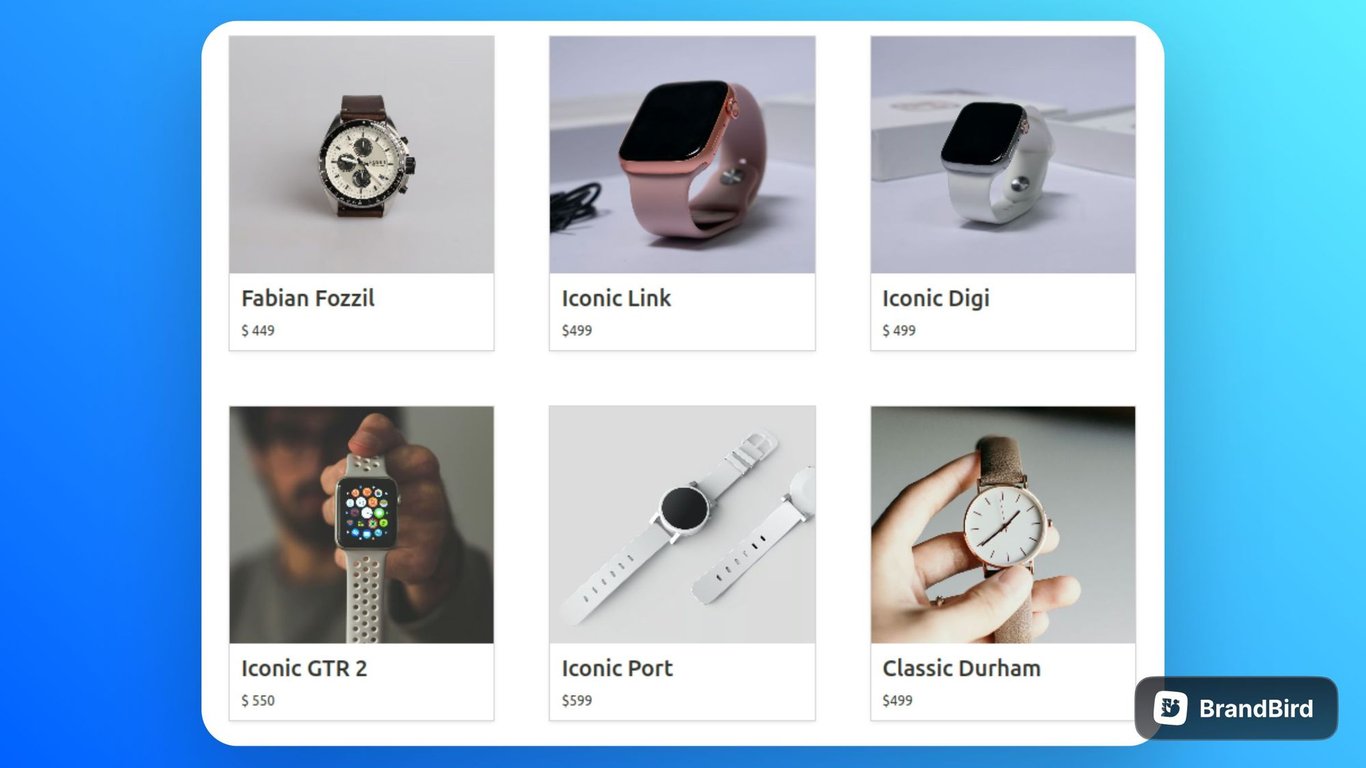
3. How to scale Gallery Cards on Hover effect
In this section, you will find how to make a hover effect for gallery cards. Use the given snippet to scale a gallery cards with hover effect.
:root{
  --db-card-gap:50px;
  --border-radius: 5px;
  --db-cover-height-small:210px;
}
.notion-collection-card {
    box-shadow: var(--db-card-shadow);
    background-color: unset;
}

.notion-collection-card {
    transform: scale(1);
    transition: all .5s ease !important;
    outline: 1px solid lightgray;
}


.notion-collection-card:hover {
    transform: scale(1.04);
    transition: all .5s ease !important;
    background: unset;
    outline: 2px solid lightgray;

}

.notion-gallery-grid {
    grid-template-columns: 1fr 1fr 1fr;
    grid-gap: var(--db-card-gap);
    border-top: unset;
}

.notion-collection-card-cover {
    border-bottom: none;
}

.notion-collection-card-property .notion-page-title-text {
    white-space: pre-wrap;
}

.notion-collection-card{
  border-radius: var(--border-radius);
}
.notion-gallery-grid{
  max-width:70%;
  margin: 0 auto;
}
.notion-collection-card-body .notion-page-icon-inline{
  display: none;
}
.notion-page-title-text{
  font-size: 20px;
}
.notion-page{
  bg-color:
}

@media (max-width:800px){
  .notion-gallery-grid {
    grid-template-columns: 1fr 1fr;
    grid-gap: var(--db-card-gap);
}
}
@media (max-width:640px){
  .notion-gallery-grid {
    grid-template-columns: 1fr;
    grid-gap: var(--db-card-gap);
}
.notion-gallery-grid{
  max-width:100%;
  margin: 0 auto;
}

}
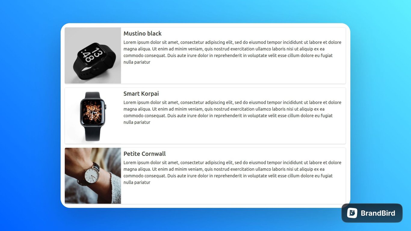
4. How to change Gallery view cards into list cards
In this section you will get to find how to change the gallery view cards into list cards. Use the given below code snippet, to change gallery view cards into list cards.
:root{
  --border-radius:5px;
  --db-cover-height-small:230px;
}
.notion-gallery-grid{
  max-width: 70%;
  margin: 0 auto;
}

.notion-collection-card{
  flex-direction: row;
}
.notion-gallery-grid{
  display: grid;
  grid-template-columns: 1fr;

}
.notion-collection-card-cover{
  width: 200px;
  height: 400px;
}
.notion-collection-card-property .notion-page-icon-inline{
  display: none;
}
.notion-collection-card-property .notion-page-title{
  font-size: 1.5rem;
}
.notion-collection-card:hover{
   background: none;
}
.notion-collection-card-body{
   flex:1;
}
.notion-property{
  white-space: pre-wrap;
}
@media (max-width:800px){
  .notion-gallery-grid{
    max-width: 100%;
  }

}
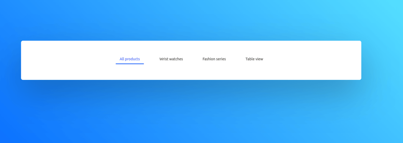
5. How to change the Gallery view tab into transition border tab
In this section, you will able to find the way to change the gallery view tab into transition border tab. Use the below given snippet to change the gallery view tab into transition border tab.
:root {
    --navbar-btn-bg-color: blue;
}

.notion-collection-view-dropdown-content {
    display: flex;
    box-shadow: none;
    align-items: center;
    justify-content: start;
    gap: 45px;
    flex-wrap: wrap;
    margin: 0 auto !important;
}

.notion-collection-view-dropdown-content-item-active-icon>svg {
    display: none !important;
}

.notion-view-type>svg {
    display: none !important;
}

.notion-collection-view-type-title {
    overflow: unset;
}

.dropdown {
    display: block;
}

.dropdown-trigger {
    display: none;
}

.dropdown-menu {
    display: block;
    position: unset;
    z-index: 99;

}

.dropdown-content {
    background: unset;
}

.notion-collection-view-dropdown-content {
    padding: 25px 0px 25px 0px;
}

.notion-collection-header {
    display: flex;
    justify-content: start;
    padding-left: 90px;
    align-items: center;
    margin: 10px 0px 60px 0px;
    justify-content: center;
}

/* user style */
.notion-collection-view-dropdown-content-item {
    padding: 5px 15px;
    color: black !important;
}

.notion-collection-view-dropdown-content-item:before {
    content: '';
    background: var(--navbar-btn-bg-color);
    display: block;
    position: absolute;
    bottom: -3px;
    left: 0;
    width: 0;
    height: 3px;
    transition: all 0.3s ease-in-out;
}

.notion-collection-view-dropdown-content-item {
    background-image: linear-gradient(to right, var(--fg-color), var(--fg-color));
    background-size: 200% 100%;
    background-position: -100%;
    position: relative;
    -webkit-background-clip: text;
    -webkit-text-fill-color: transparent;
    transition: all 0.3s ease-in-out;
}

.notion-collection-view-dropdown-content-item:hover {
    background-image: linear-gradient(to right, var(--navbar-btn-bg-color), var(--navbar-btn-bg-color));
    background-size: 200% 100%;
    background-position: -100%;
    position: relative;
    -webkit-background-clip: text;
    -webkit-text-fill-color: transparent;
    transition: all 0.3s ease-in-out;
    opacity: 0.6;
}

.notion-collection-view-dropdown-content-item {
    padding: 5px 15px;
}

.notion-collection-view-dropdown-content-item:hover {
    background-position: 0;
}

.notion-collection-view-dropdown-content-item:hover::before {
    width: 100%;
}

.notion-collection-view-dropdown-content-item.notion-collection-view-dropdown-content-item-active::before {
    content: '';
    display: block;
    position: absolute;
    bottom: -3;
    left: 0;
    transition: all 0.3s ease-in-out;
    width: 100%;
}

.notion-collection-view-dropdown-content-item-active {
    background-image: linear-gradient(to right, var(--navbar-btn-bg-color), var(--navbar-btn-bg-color));
    background-size: 200% 100%;
    background-position: -100%;
    position: relative;
    -webkit-background-clip: text;
    -webkit-text-fill-color: transparent;
    transition: all 0.3s ease-in-out;
}
Explore the features of Gallery card using the given classes
Classes
Customize the different gallery views on your Bullet site using the provided classes.
Class | Description |
.notion-collection | Represents the collection element. |
.notion-collection-header-title | Represents the title of a collection. |
.notion-gallery-grid-size-small | Represents a small-sized grid view for the gallery collection. |
.notion-gallery-grid-size-medium | Represents a medium-sized grid view for the gallery collection. |
.notion-gallery-grid-size-large | Represents a large-sized grid view for the gallery collection. |
.notion-collection-card | Represents a card within a collection. |
.notion-collection-card-cover | Represents the cover/image of a collection card. |
.notion-collection-card-body | Represents the body/content of a collection card. |
.notion-collection-card-property | Represents a property/attribute of a collection card. |
How to use
- Copy the provided CSS code snippet containing the gallery class into your CSS file or code > CSS(in bullet site dashboard) section.
- Add or Modify the gallery classes according to your desired customization.
- Save the code and publish the site.
On this page
Customize Gallery View1. How to customize hover effect of Gallery cards2. How to make overlay Gallery Cards3. How to scale Gallery Cards on Hover effect4. How to change Gallery view cards into list cards5. How to change the Gallery view tab into transition border tabExplore the features of Gallery card using the given classesClasses
 Made with Bullet